
Build Log: Why I Made 225 Original Diagrams for One Calculator Site
By David Miles
Over the last few months I drew 225 original technical diagrams for RemodelCalculators — one for nearly every concept the site's 70+ calculators touch. Not stock photos, not clip art: labeled, to-code, made-for-this-site figures. People keep asking why I'd spend that kind of time on pictures for a calculator. This is the honest answer, and why I think it's one of the highest-leverage things I've built all year.
The problem with a calculator that has no pictures
A calculator page is, by default, thin. An input box, a number, a button. Google and — increasingly — the LLMs that summarize the web can't tell a genuinely useful tool from a spammy one by the form fields alone. What separates them is the explanation around the tool: the context that proves a real person who understands the trade built this.
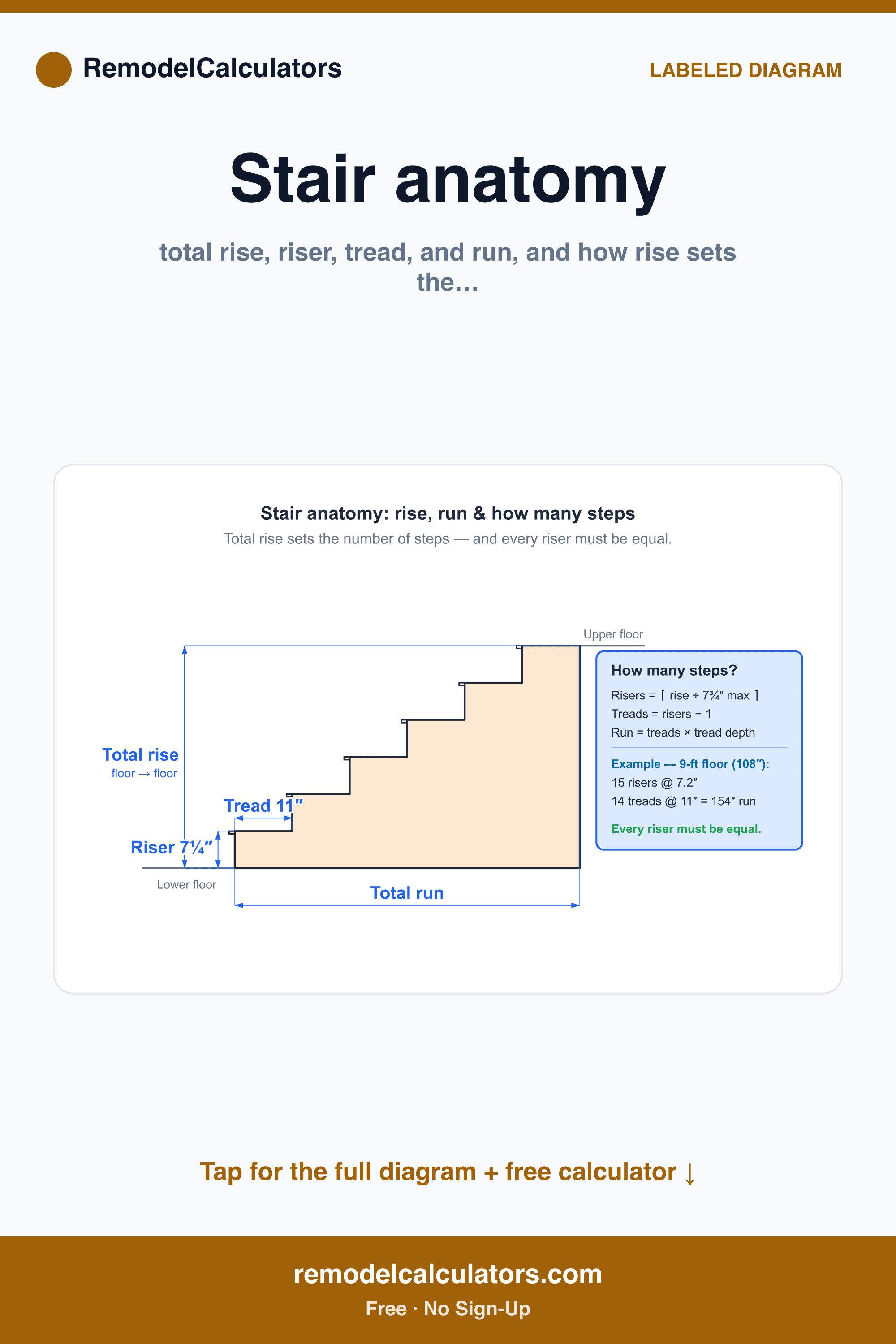
You can write that context in prose. But construction is spatial. "The riser is the vertical part and the tread is the part you step on, and total rise divided by 7¾ inches gives your number of steps" is a paragraph nobody finishes. One labeled diagram says it instantly:
One diagram per concept, not one per calculator
The first instinct is to make one hero image per calculator. That's the wrong unit. Calculators share concepts — a dozen tools touch "cubic yards," several touch "IECC climate zone," a whole cluster depends on "what actually goes under a slab." So I drew diagrams at the level of the concept, then reused each one across every calculator and article that references it.
That's why 70+ calculators produced 225 diagrams rather than one apiece: each tool needs several concepts explained, and each concept diagram earns its keep in multiple places. Same principle as the calculator framework itself — build a reusable primitive once, wire it in everywhere.
Why original beats stock (the real EEAT angle)
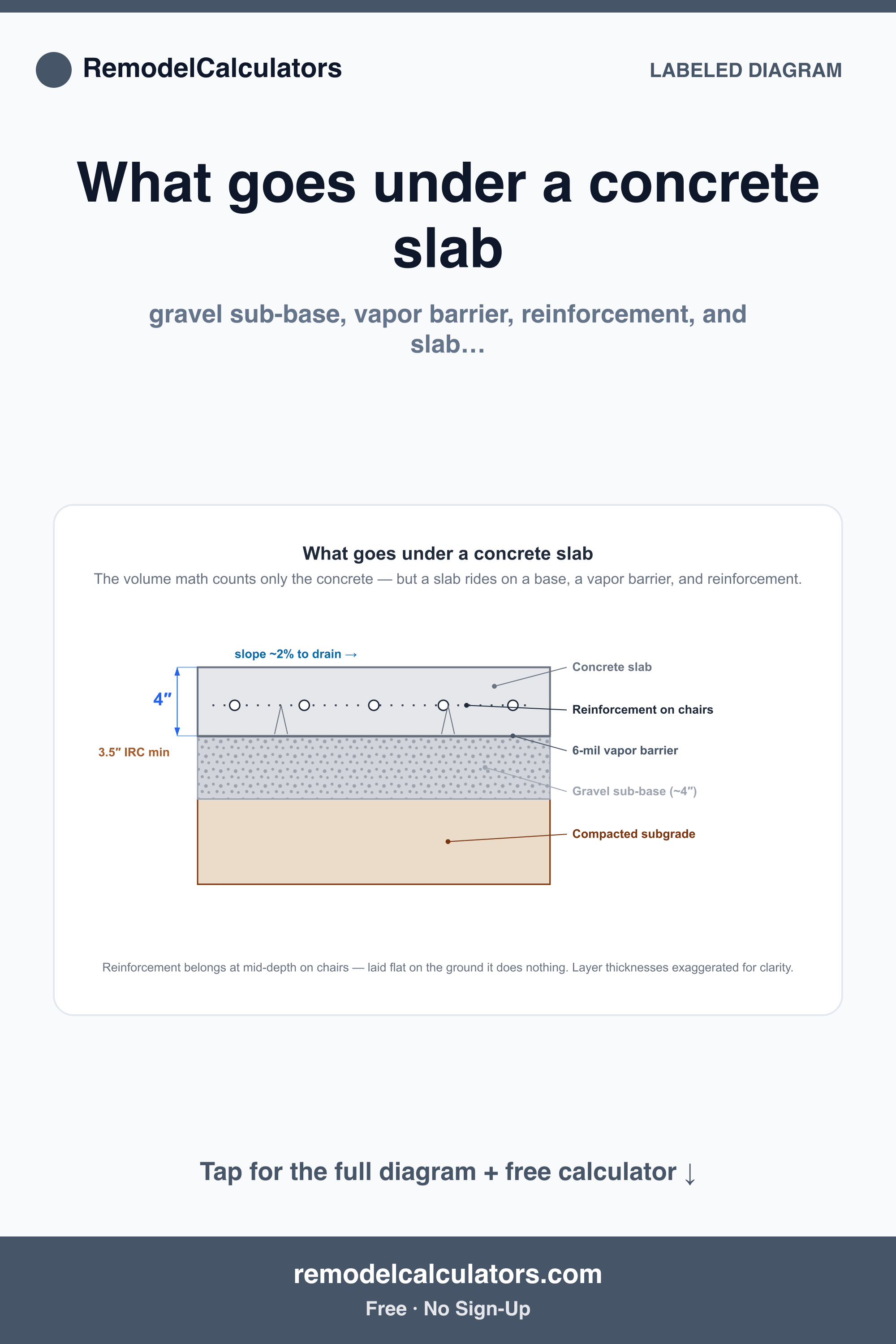
There are stock illustrations of concrete slabs. None of them label the 6-mil vapor barrier, mark the 3.5" IRC minimum, or make the point that reinforcement belongs at mid-depth on chairs — laid flat on the ground it does nothing. That last detail is exactly the kind of thing a person who's poured a slab knows and a stock library doesn't:
Original diagrams are the one asset AI-generated competitor content can't produce and scrapers can't meaningfully copy. They signal firsthand experience — the first "E" in E-E-A-T — better than any "written by an expert" byline. And they're genuinely linkable: other sites embed a clear diagram and credit it, which is the kind of link you can't buy.
Making the diagrams double as a distribution channel
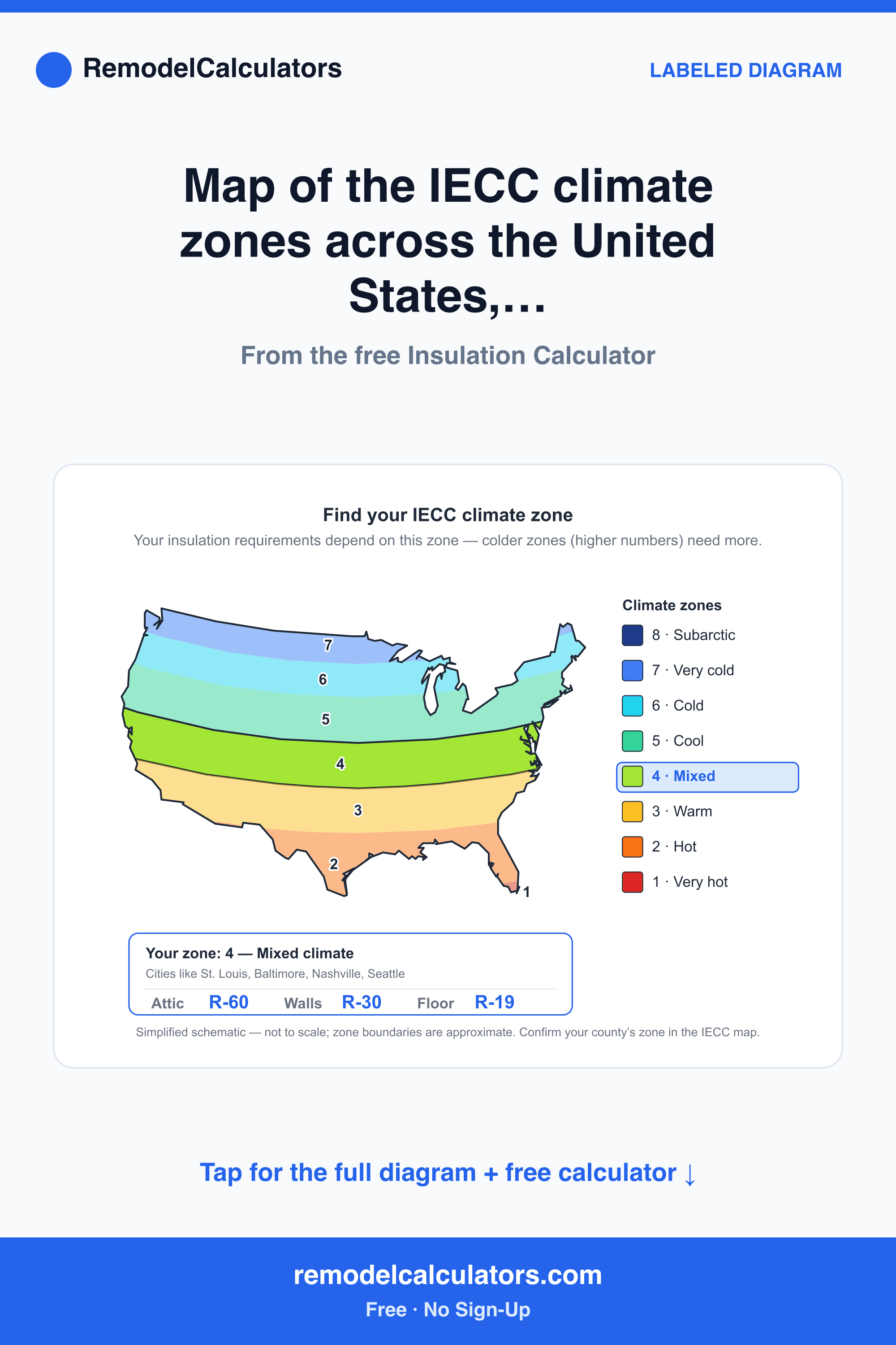
Here's the multiplier. Every diagram is exported in a 2000×3000 portrait frame with a branded header, a one-line takeaway, and a "tap for the full diagram + free calculator" footer. That's not an accident — it's Pinterest's native format. The same asset that explains a concept on-site is also a pin that sends visual searchers back to the calculator:
One production pass, two jobs: on-page explainer and off-site acquisition. When the marginal cost of a second use is basically zero, you take it.
How I kept 225 of them consistent
225 hand-made images would normally be a maintenance nightmare. The trick was to treat them like components, not artwork. Every diagram is generated from the same template: fixed brand bar, a title/subtitle slot, a bordered figure card, and a standard footer. Only the inner drawing changes. That keeps the whole library visually coherent, makes a site-wide restyle a one-template change instead of 225 edits, and means adding the 226th diagram is a small, boring task rather than a design project.
Was it worth it?
It was slow, and it's the kind of work with no instant payoff — no single diagram moves a number the day it ships. But that's also why it's defensible. A competitor can copy your calculator's math in an afternoon. Reproducing 225 correct, consistent, original diagrams is months of unglamorous work most people won't do — which is exactly why it's worth doing.
Takeaways if you're building a tool site
- Illustrate at the level of the concept, not the page — one good diagram gets reused across many tools and articles.
- Make it original. The value isn't drawing skill; it's the expert judgment about which details to label. That's what can't be faked or scraped.
- Export in a format that doubles as distribution. A portrait, branded, captioned figure is both an on-page explainer and a Pinterest pin.
- Template the container so the library stays consistent and cheap to restyle. Treat diagrams like components.
- Expect it to compound slowly. This is authority-building, not a growth hack.
This is the sort of unglamorous, compounding work that most of my sites are built on. More teardowns and build logs are in the build logs.
More from the workshop
I build and operate a portfolio of niche websites and interactive tools — and write the build log behind each one. Browse the rest of the projects and notes.
See the projects →